Flower-to-Compost Packaging Design
Role : Identity & Packaging Design
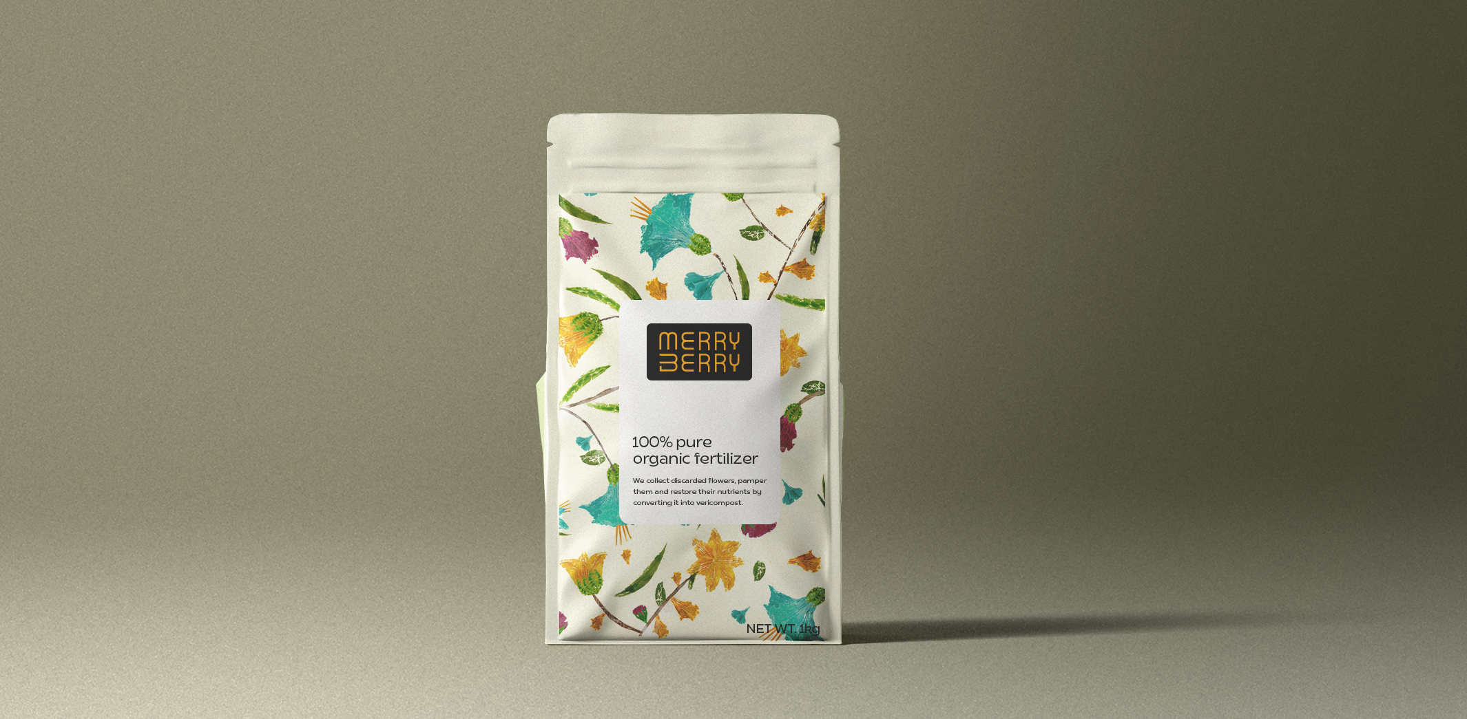
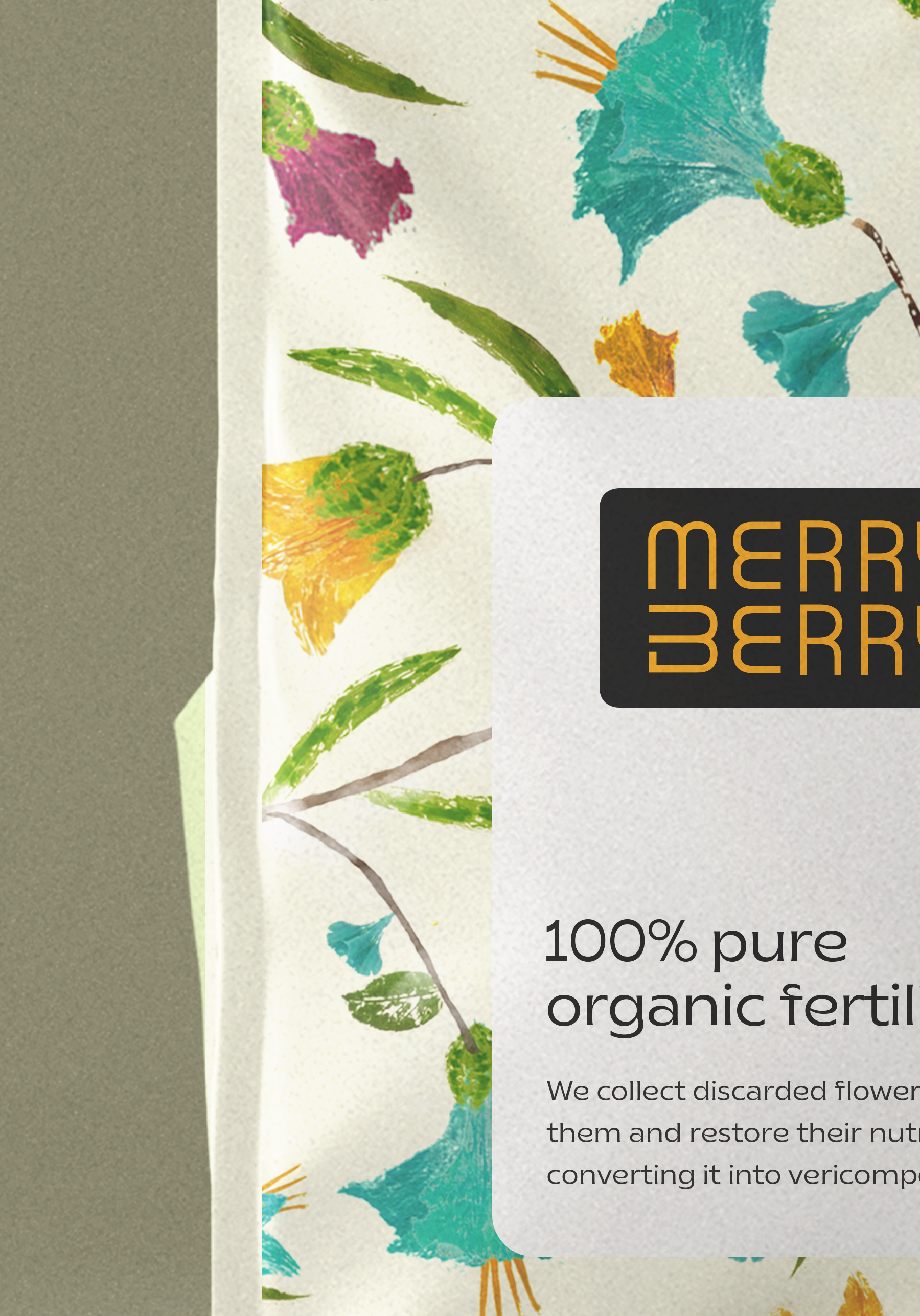
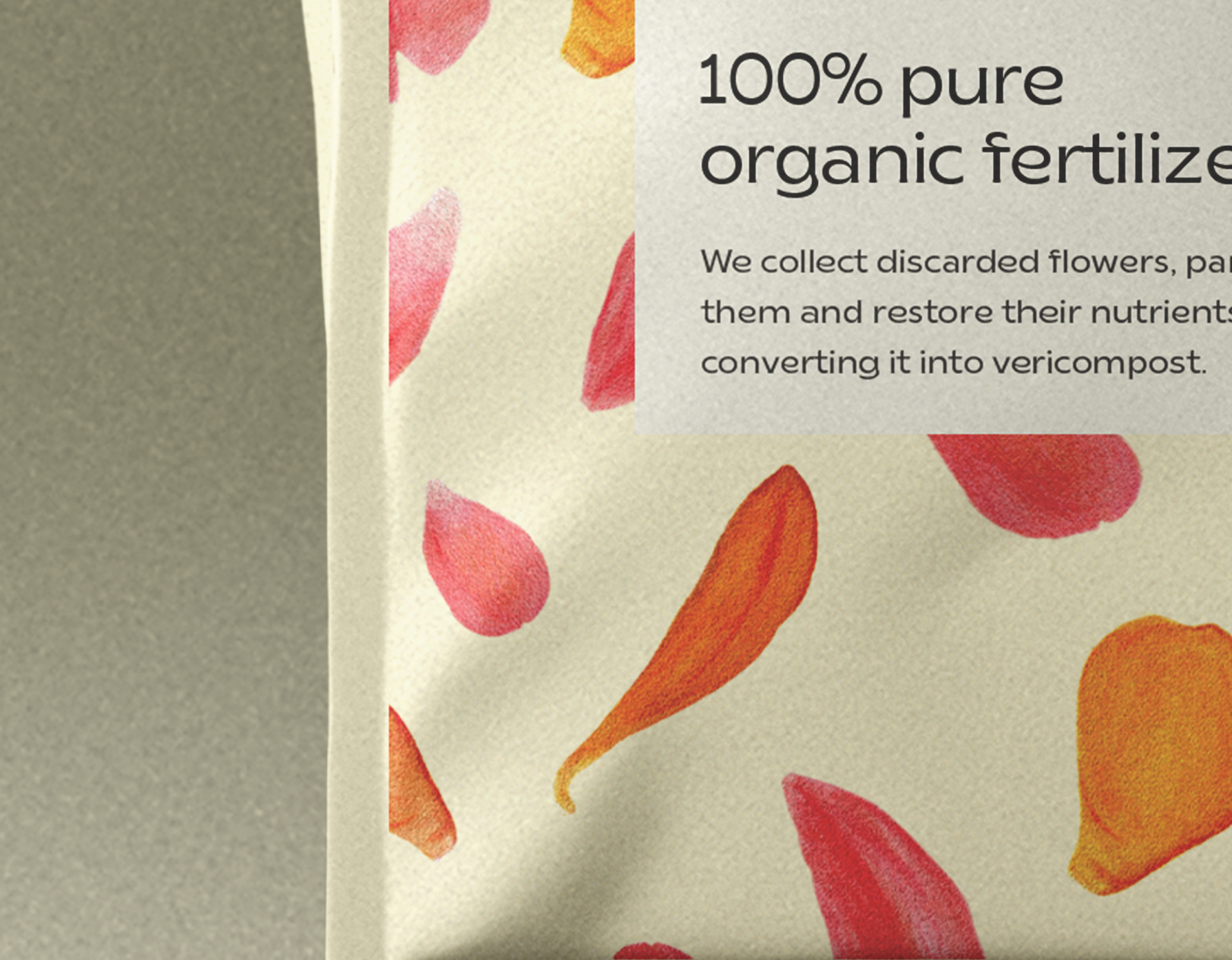
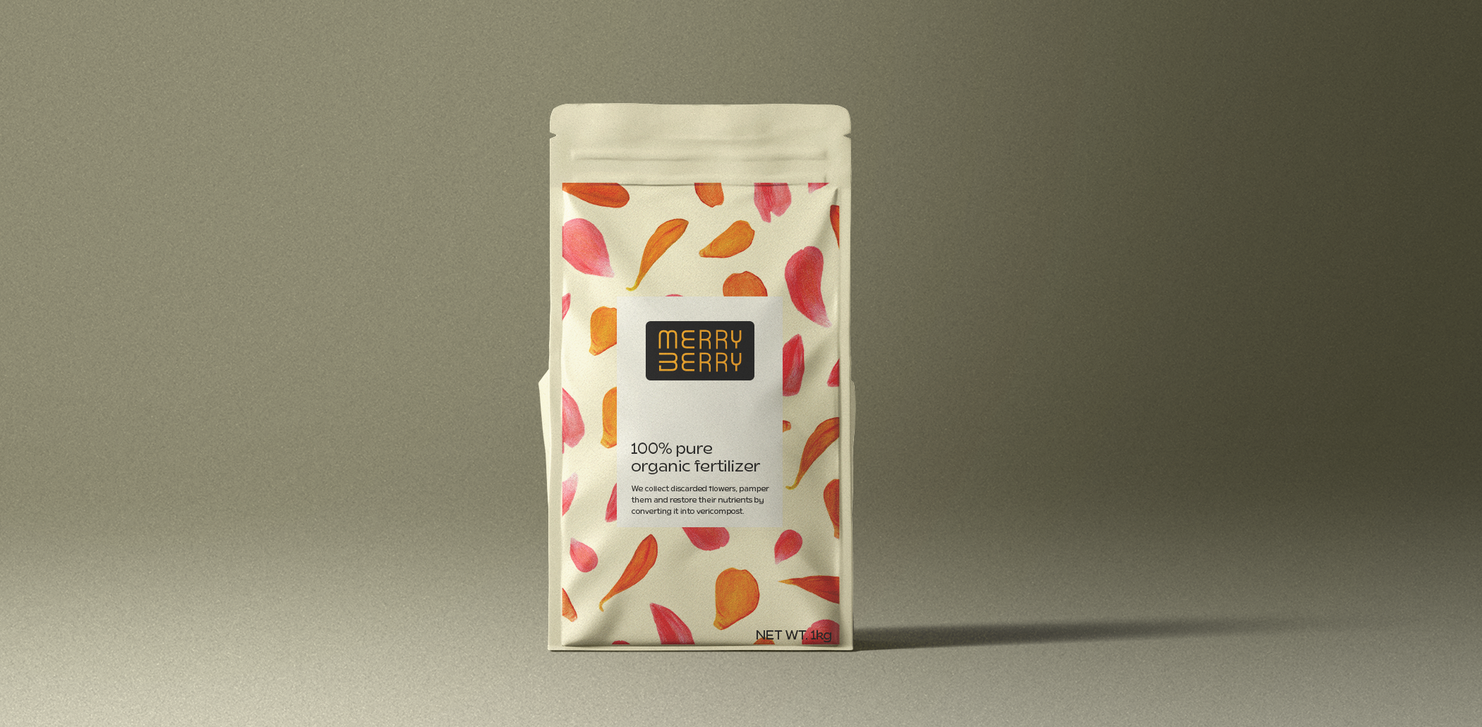
Merry Berry is brand offering natural organic fertilizer made from discarded flowers, primarily targeting the B2C market. In designing the logo, we maintained a structured approach, but for the packaging we experimented with an organic style.
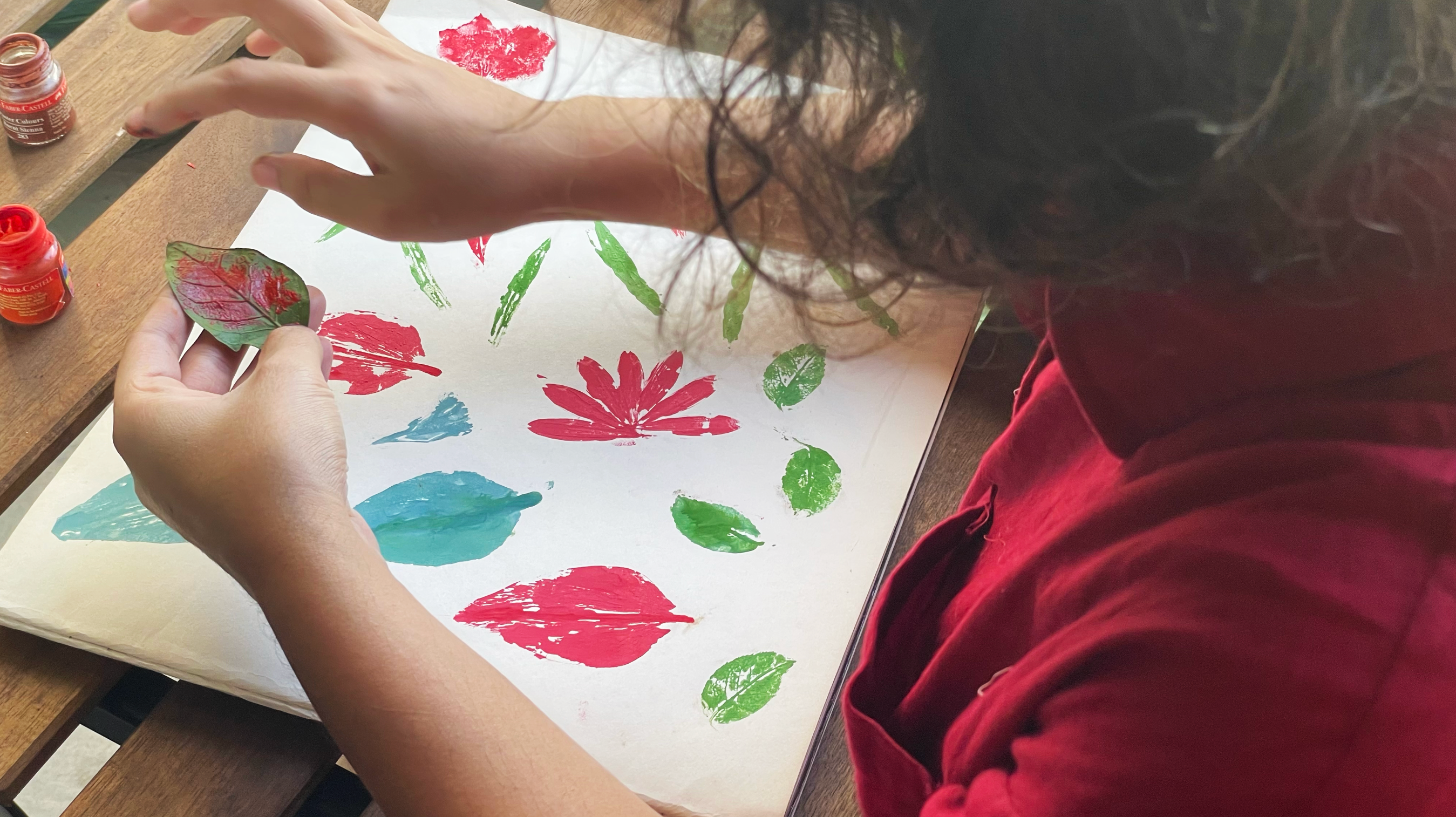
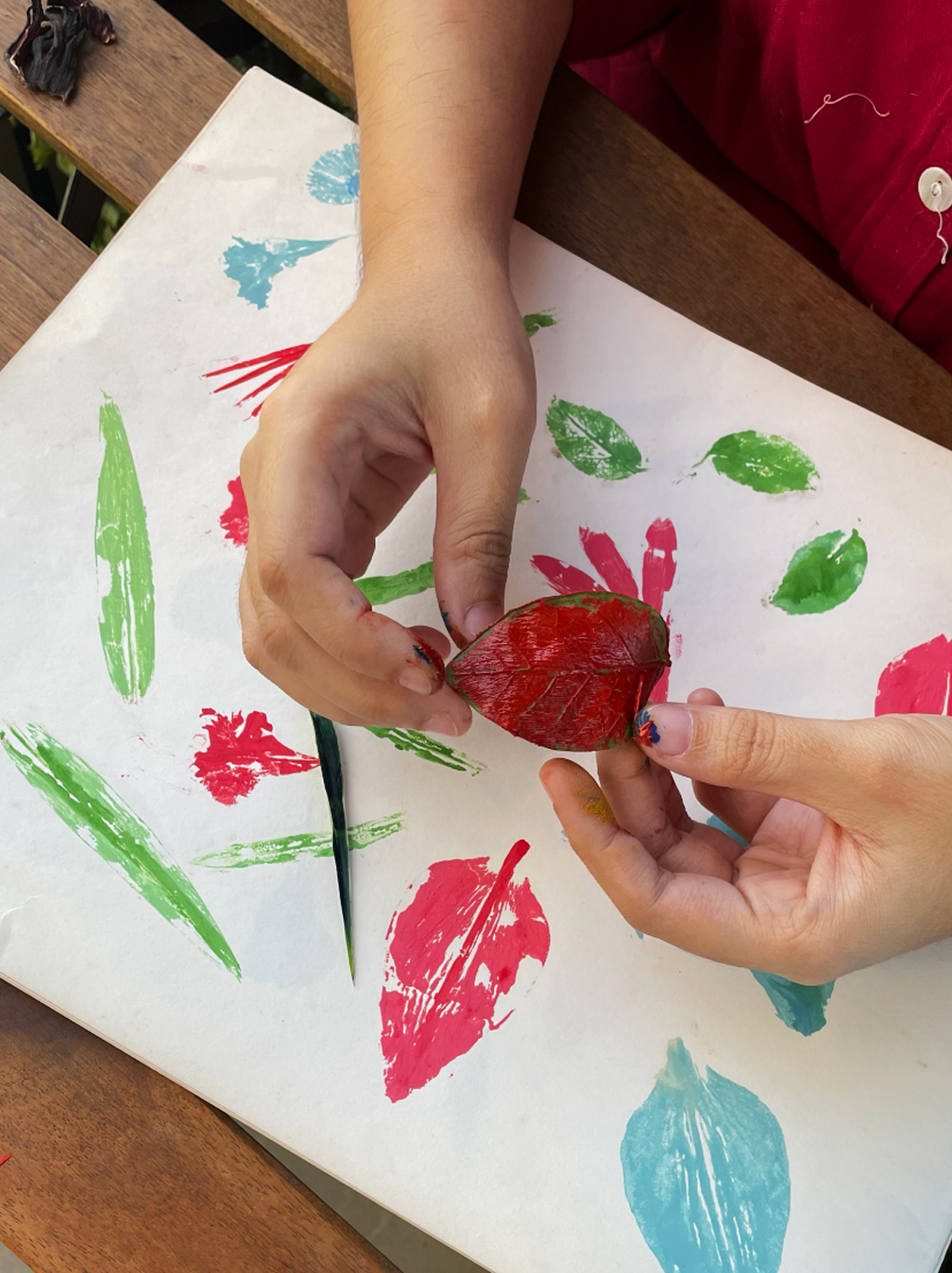
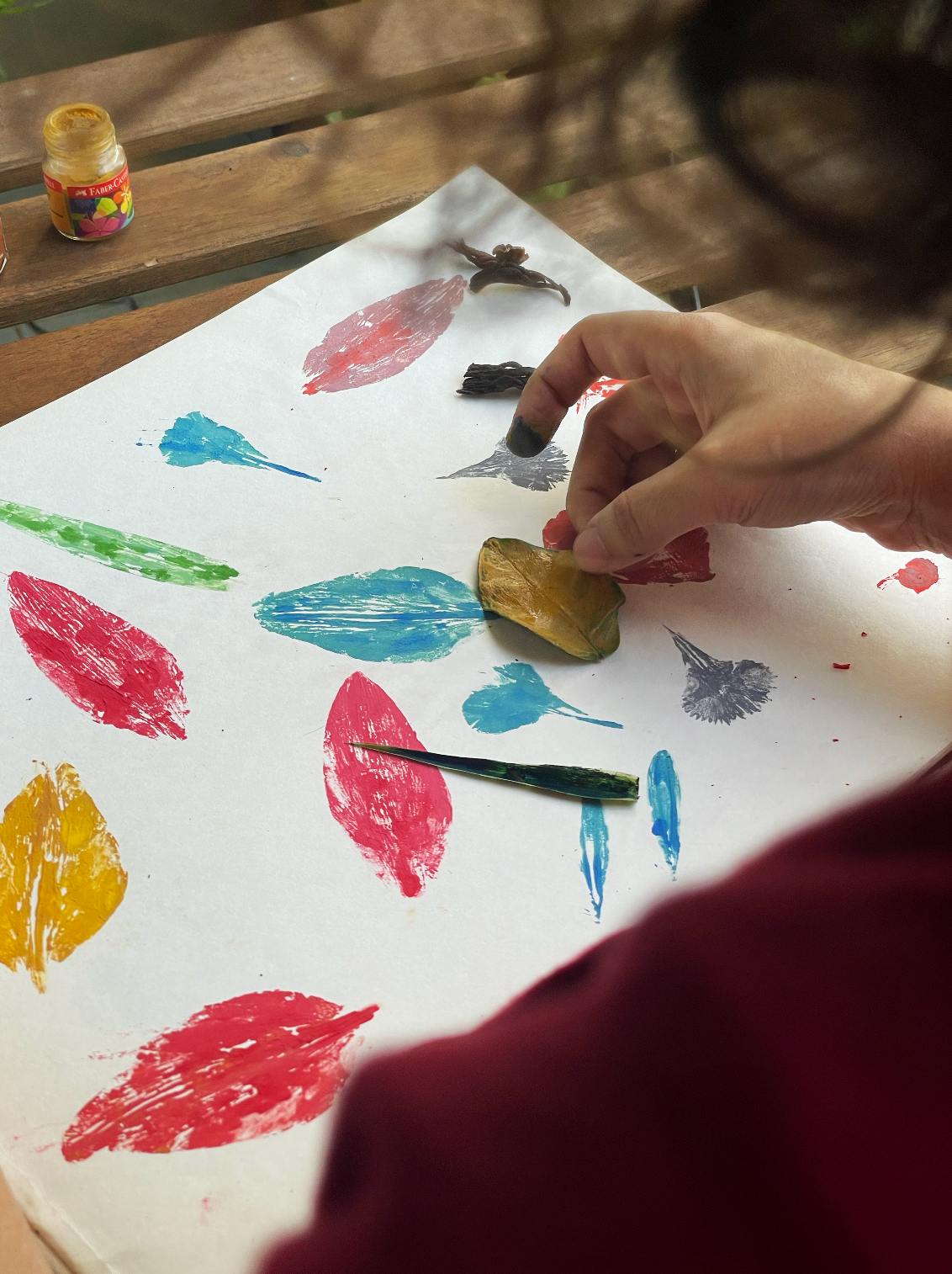
Embracing the analog
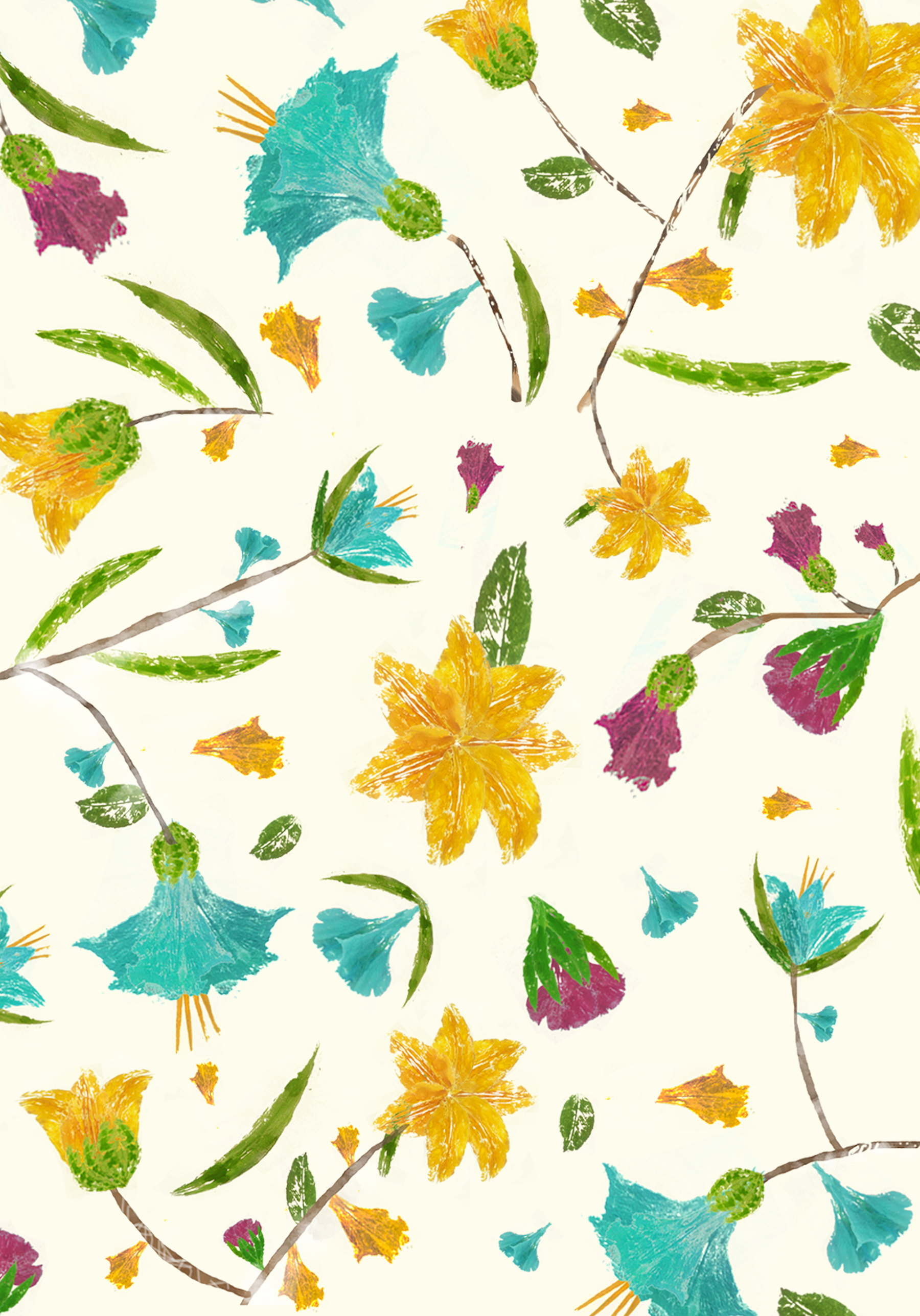
My first approach was to go organic and to make patterns using real flower petals.
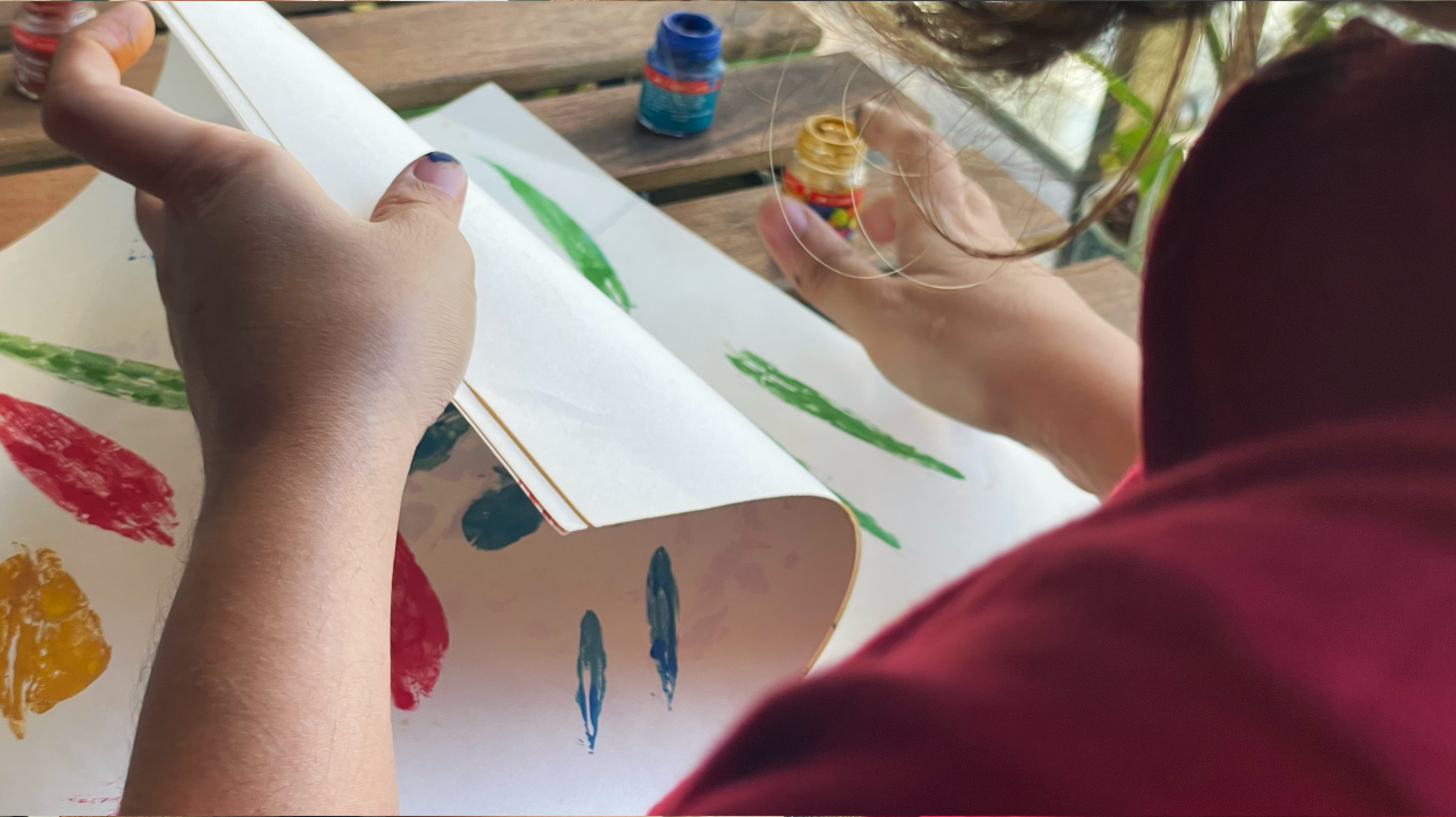
For this, I scouted for fallen petals, buds and leaves, dipped them in paint, made imprints and scanned them. It was a hands-on experimentative process which I enjoyed a lot!
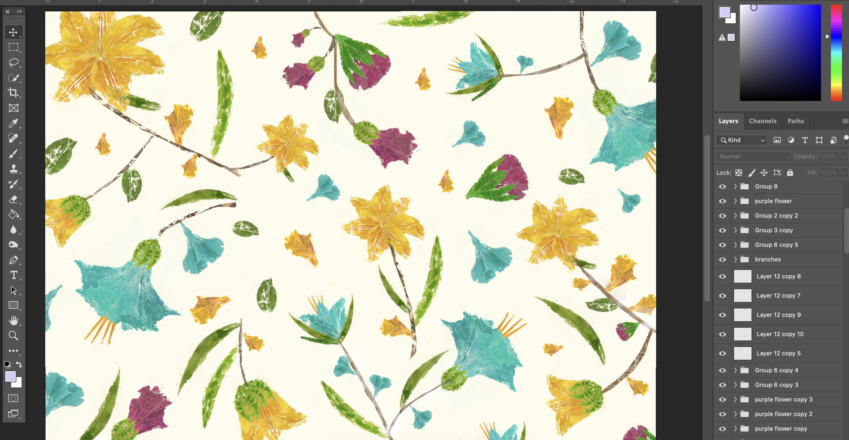
Pattern arrangement
Once all the flower petals, leaves and bud were scanned, next step was to clean-up and tweak the images to create different flower arrangements, and then to set everything in a pattern.
Digital textures
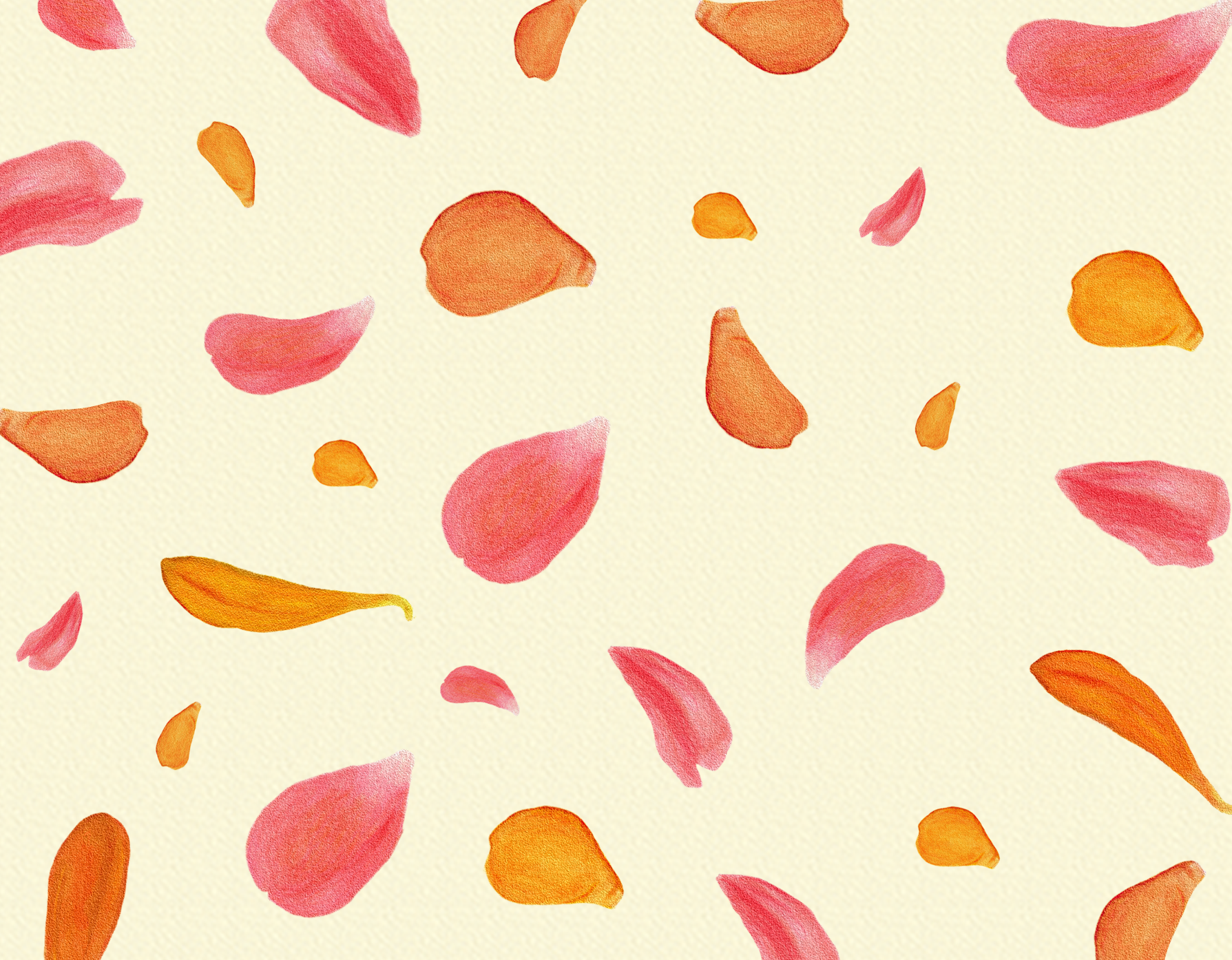
For the second approach I went digital and used textured brushes to draw a variety of petals to retain the organic feel.
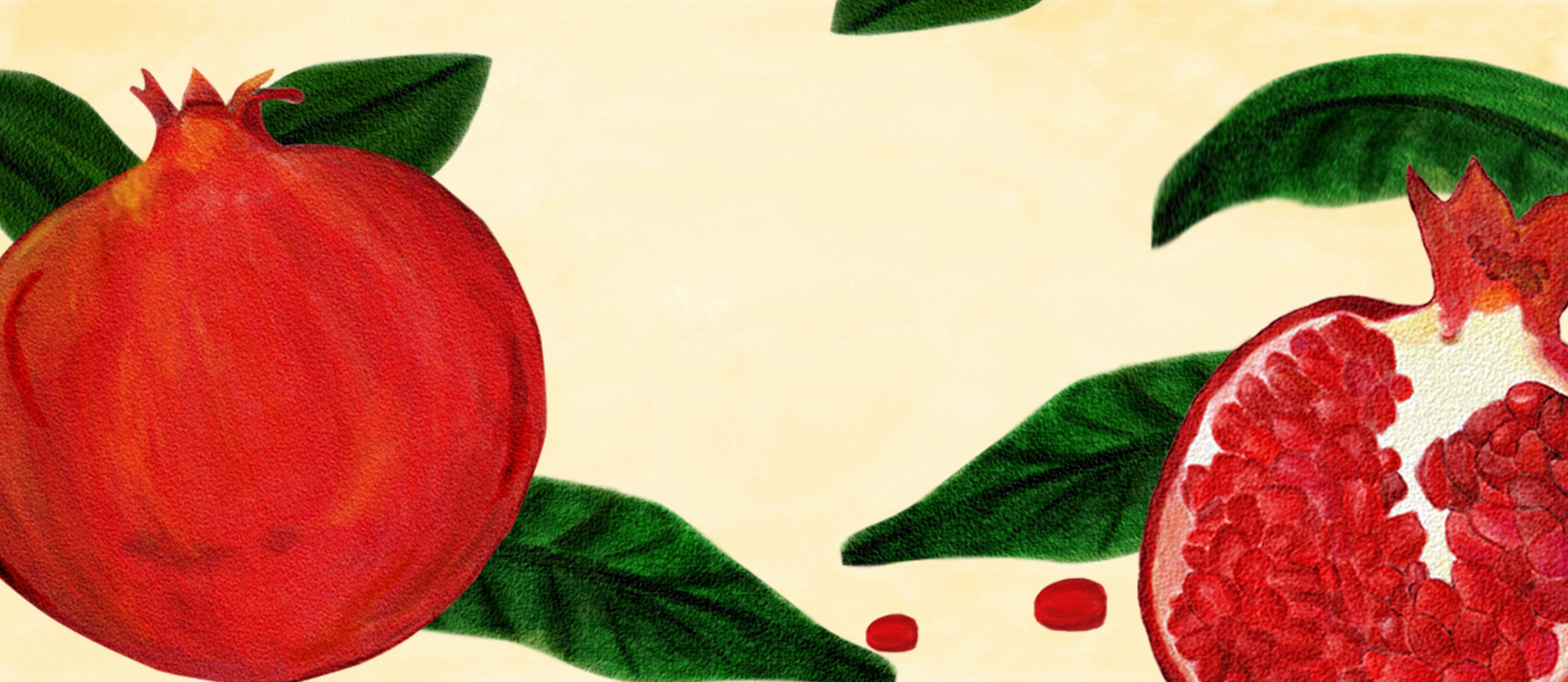
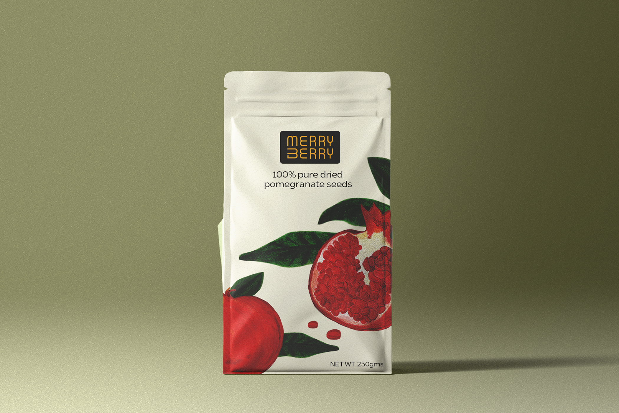
Packaging for dried pomegranate seeds
This packaging illustration was for dried pomegranate seeds.
To maintain an organic aesthetic, I used textured brushes to illustrate the pomegranates digitally.